Welcome to On Verticality. This blog explores the innate human need to escape the surface of the earth, and our struggles to do so throughout history. If you’re new here, a good place to start is the Theory of Verticality section or the Introduction to Verticality. If you want to receive updates on what’s new with the blog, you can use the Subscribe page to sign up. Thanks for visiting!
Click to filter posts by the three main subjects for the blog : Architecture, Flight and Mountains.
Constant-Désiré Despradelle’s Beacon of Progress
He was possessed by the idea of a monument embodying the characteristics of American civilization, to be a memorial to the genius of the American people and a reminder of the glories of the Columbian Exposition in Jackson Park. These words describe the feeling of Constant-Désiré Despradelle after he visited the World’s Columbian Exposition of 1893 in Chicago. The exposition saw an entire complex of temporary buildings built in Jackson Park, only to be demolished after the fair. For Despradelle, Chicago needed a permanent monument to embody the spirit and grandeur of the fair. He set to work designing his vision, and the final result is pictured above.
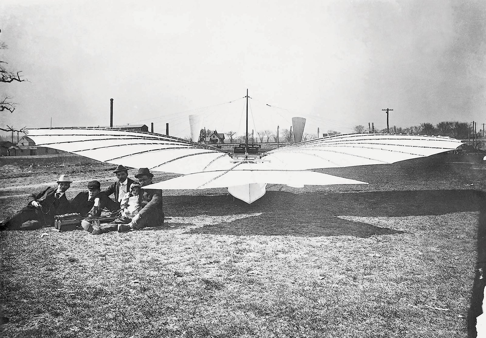
Gustave Whitehead’s Flying Machines
Gustave Whitehead was a German-born aviation pioneer that emigrated to the United States in 1893. He subsequently built and tested a number of flying machines, and some believe he achieved the first ever powered, controlled flight. As with most claims of this nature, it’s a difficult thing to prove and will most likely always have controversy surrounding it. Because of this, his machines and the alleged flights they took have a sense of mystery about them. To add to this mystery, Whitehead experimented with many different types of machines, including both manned and unmanned machines and both gliders and self-powered machines.
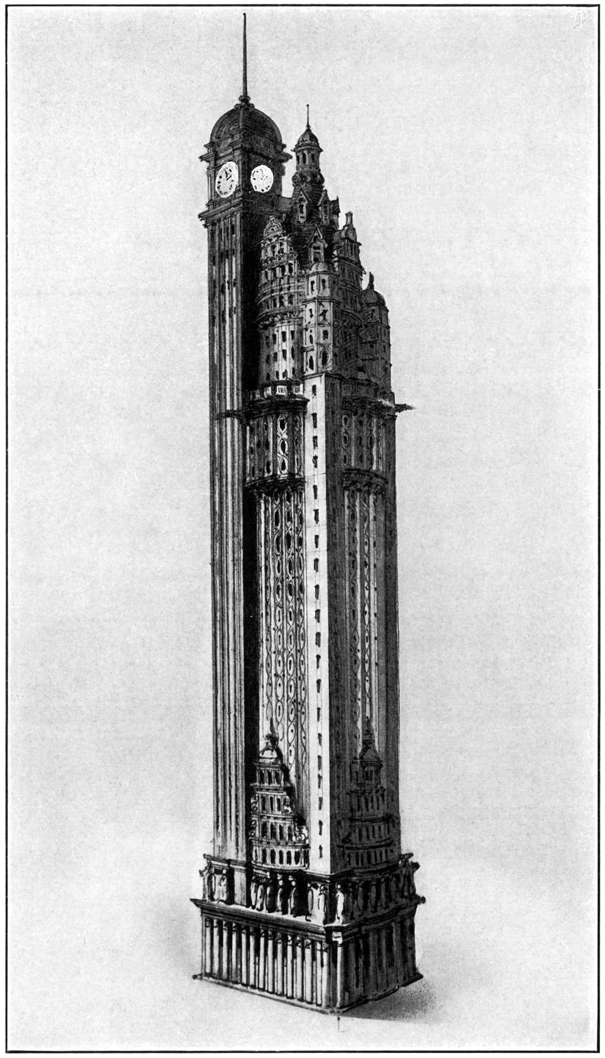
The New York American Journal Headquarters
Throughout my research into tall buildings and verticality, I’ve come across myriad examples of proposed and unbuilt structures. Some are alternate proposals by famous architects. Some are one-hit wonders that make their way into the mainstream history of skyscrapers. Some, like the one pictured above, are just intriguing and obscure images without much context. Details on this building are scarce, but from what I can find this is a proposal by Barney & Chapman Architects for the headquarters of the New York American Journal. It was located at Columbus Circle in New York City, on the site occupied by the Museum of Arts and Design today.
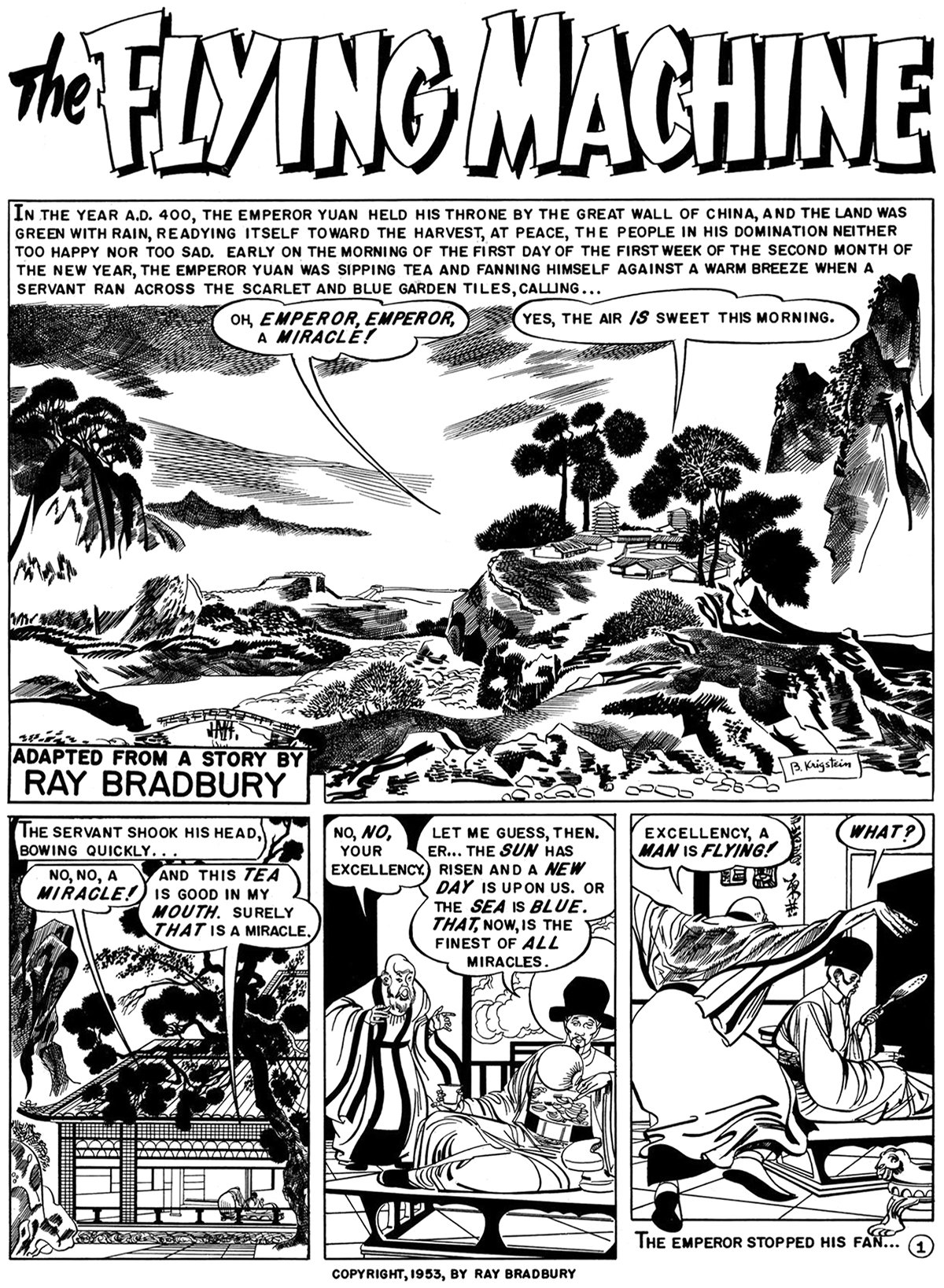
The Flying Machine by Ray Bradbury
With great power comes great responsibility. This is the major theme of Ray Bradbury’s short story from 1953, titled The Flying Machine. It was adapted into a comic in 1954 by Al Feldstein, and the full piece is pictured here. It tells the story of a meeting between an emperor and an inventor who has built a flying machine. The inventor is an optimist who experiences the full delights of flying, while the emperor is a pessimist who fears the technology will fall into the wrong hands. It’s a theme that runs much deeper than human flight, but Bradbury’s choice to feature the flying machine demonstrates the power of flight for humanity.
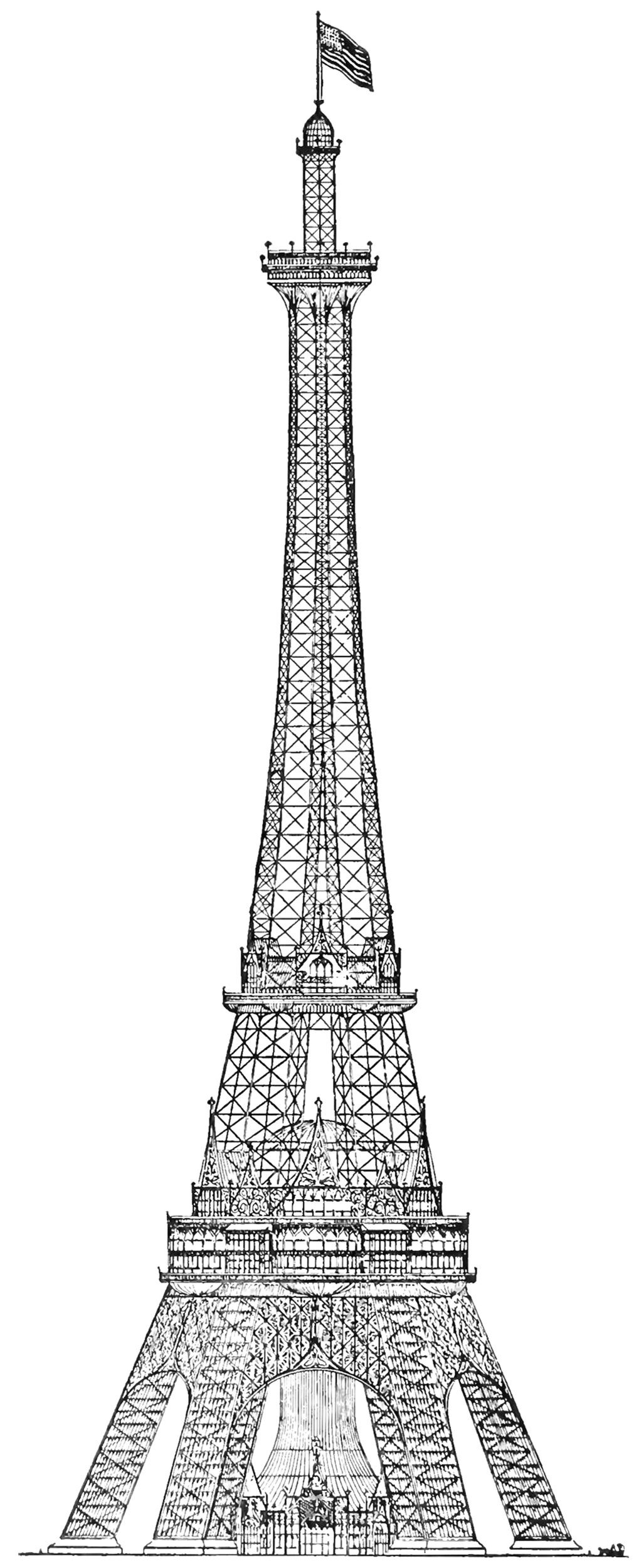
The Proctor Steel Tower
When the Eiffel Tower was completed for the 1889 World’s Fair in Paris, the world took notice. France had constructed the world’s tallest structure, and it immediately became the envy of the world. The next World’s Fair would take place in Chicago in 1893, and the organizers wanted to take the opportunity to out-do the Eiffel Tower with their own structure. The most successful proposal was the Proctor Tower, which is pictured above. It was 335 meters (1,100 feet) tall, which is roughly 12 meters (40 feet) taller than the Eiffel Tower.
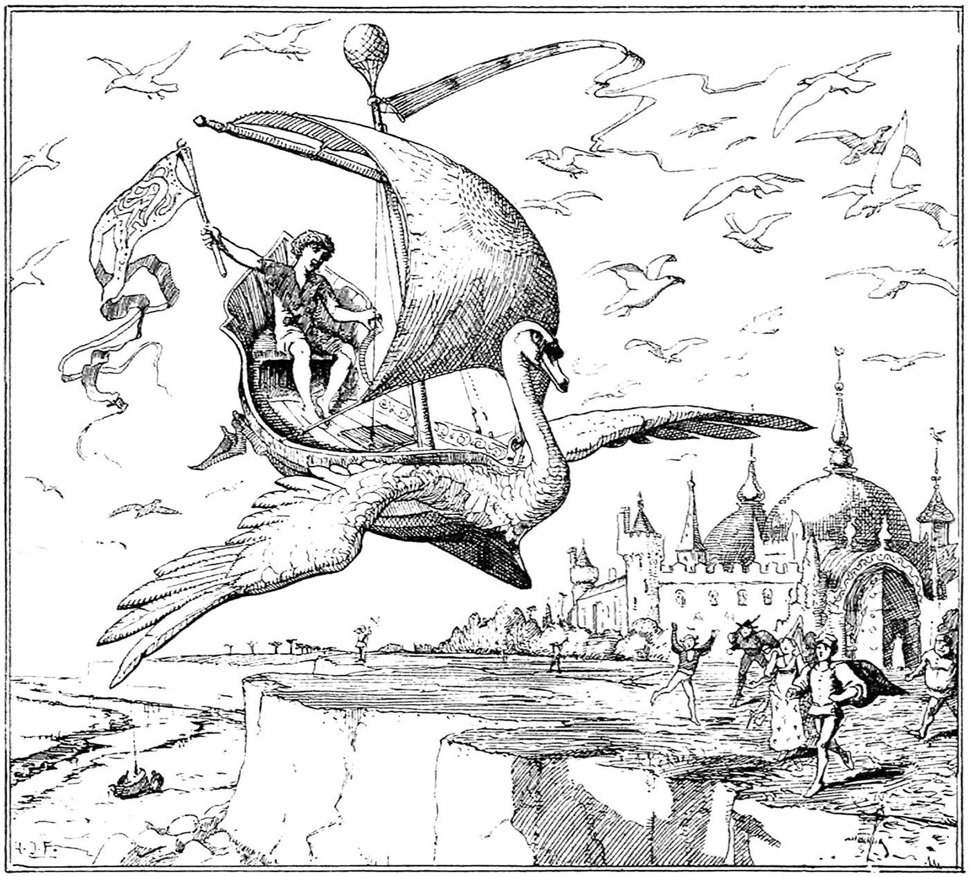
Minnikin’s Flying Ship
‘Now go over fresh water and salt water, over hill and dale, and do not stop until thou comest to where the King’s daughter is,’ said Minnikin to the ship, and off it went in a moment over land and water till the wind whistled and moaned all round about it.
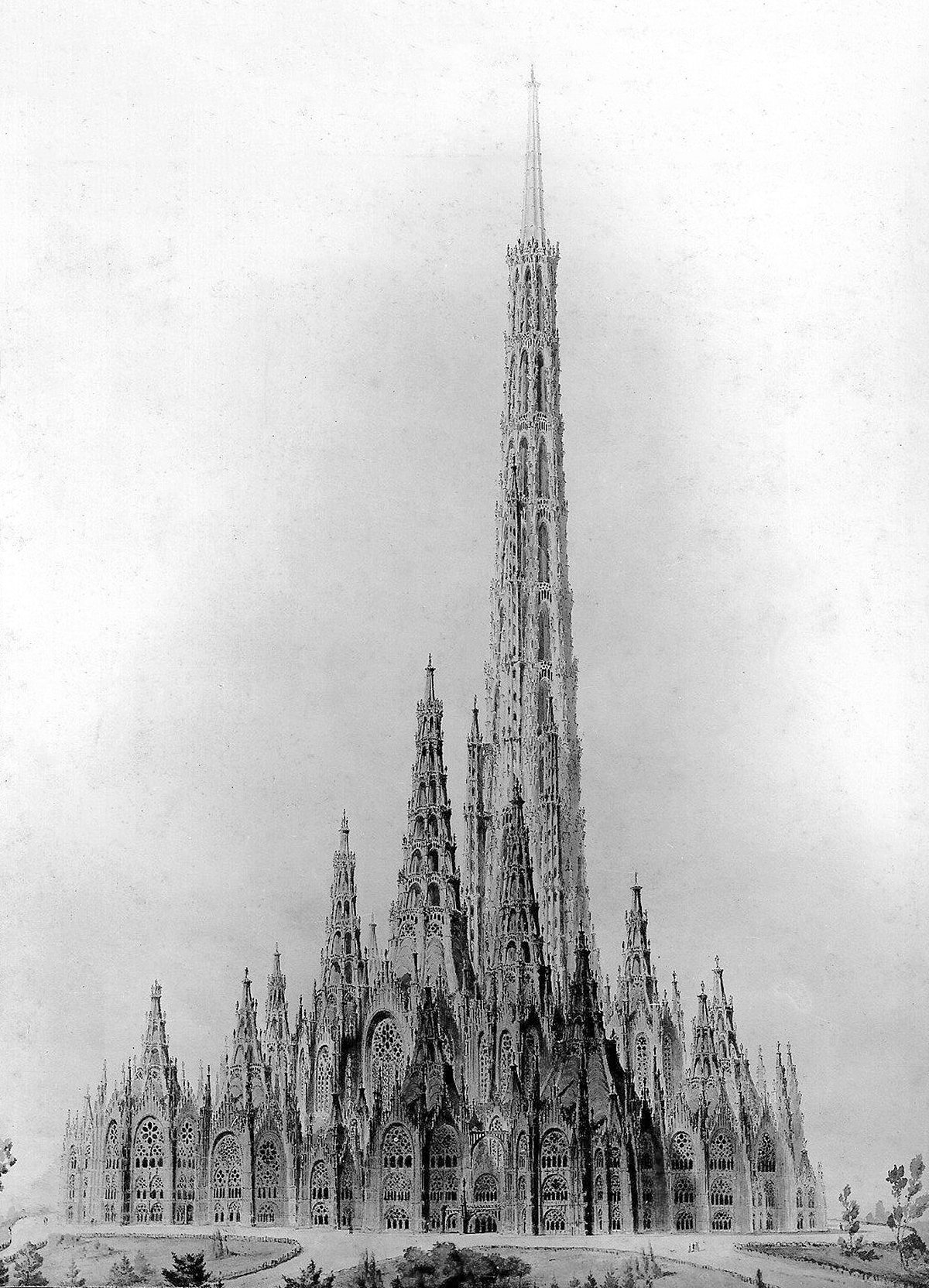
Friedrich Gösling’s Proposal for the Reichstag
Pictured above is a competition entry for the original Reichstag building in Berlin. It was designed in 1871 by German architect Friedrich Gösling, and it’s a big departure from the Neoclassic design that ended up getting built. Gösling intended the design to embody the German way of life and the German idea of the state. He expressed these ideas with an organic plan and a Neogothic structure that seems to point upward with its myriad steeples and pinnacles. I suspect this upward focus was how Gösling’s idea of the German way of life in built form, because it’s so prevalent throughout his design. He was using verticality to project a sense of optimism about Germany and its future.
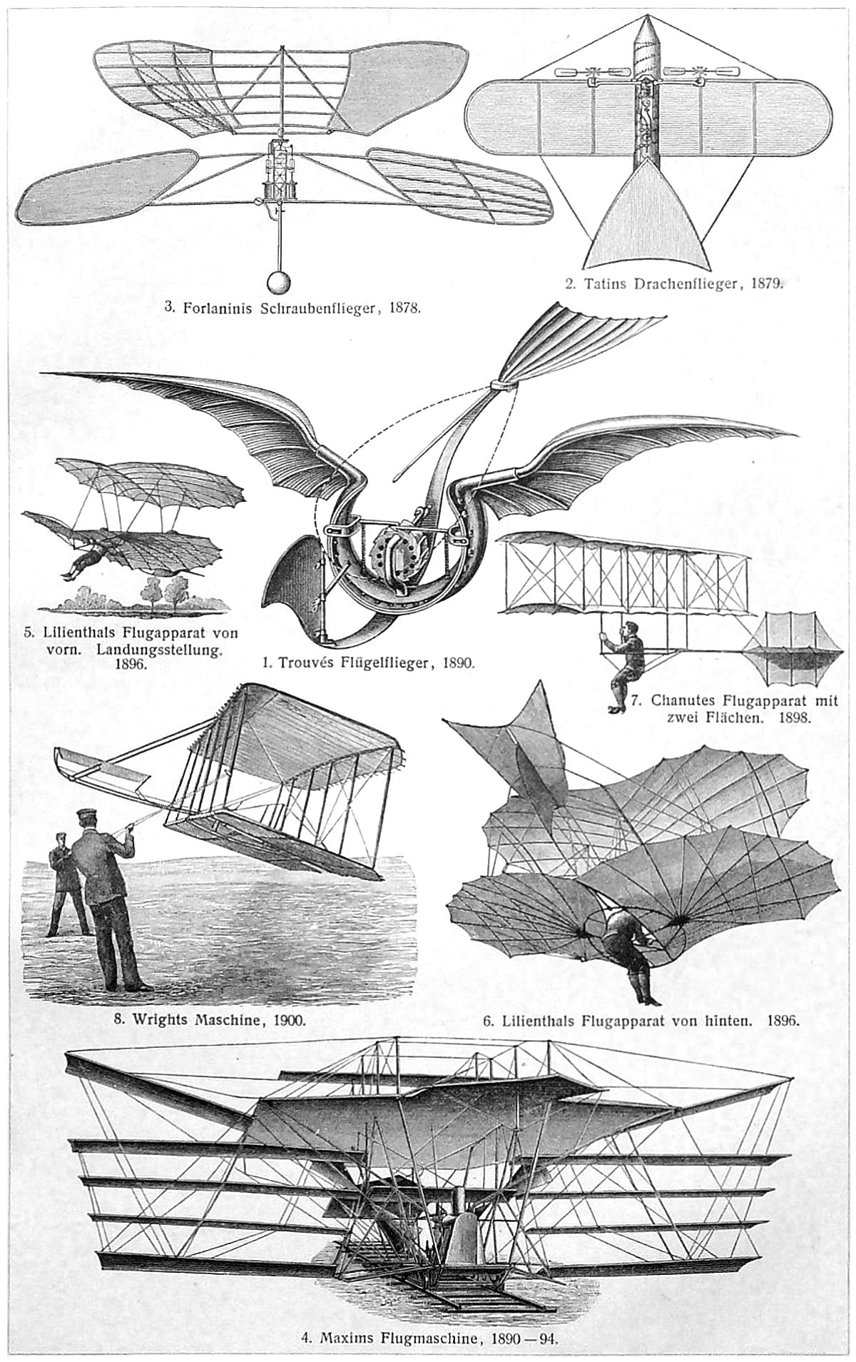
Early Aeronautics
Pictured above is a collage of early flying machines, originally published in the German encyclopedia Meyers Konversations Lexikon. I love collages like this because the illustrator inevitably must pick and choose which examples to show. This is most likely done for a combination of reasons, including available illustrations, the most famous examples, and page layout.
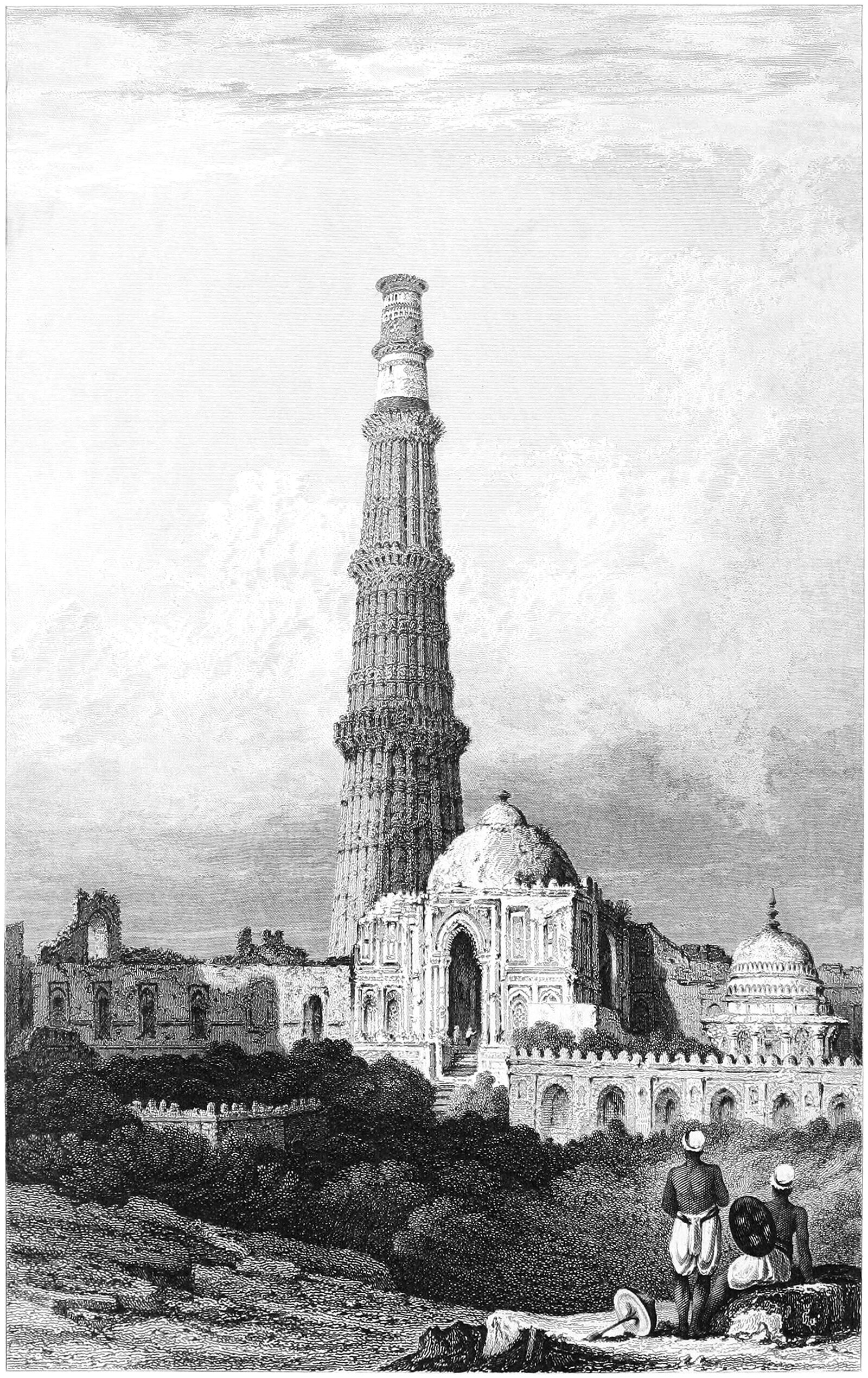
The Qtub Minar and the Verticality of Minarets
Pictured above is the Qtub Minar, which was built around 1200 just outside Delhi, India. It’s a fascinating example of a cross-culture artifact, and it departs from traditional minarets in three ways. First, it was built as the focal point of the Qutb complex and exists on its own, without an adjacent mosque. Second, it was built as a victory tower as well as a minaret. This means it was partly a monument to military victories, much like a triumphal column in Ancient Rome. Lastly, the minaret was designed by Muslim architects, but built by Hindu craftsman and laborers.
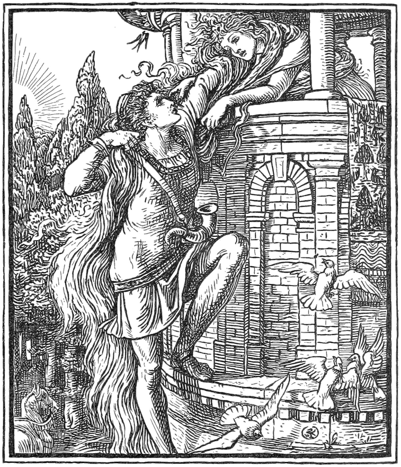
Rapunzel and the Isolation of Height
The story of Rapunzel and her long hair is a well-known folk tale with ancient origins. It’s the story of a damsel-in-distress and a prince who comes to rescue her. It’s well-worn territory in the world of folk tales, but the specifics of the story reveal a subtext that’s based on verticality.
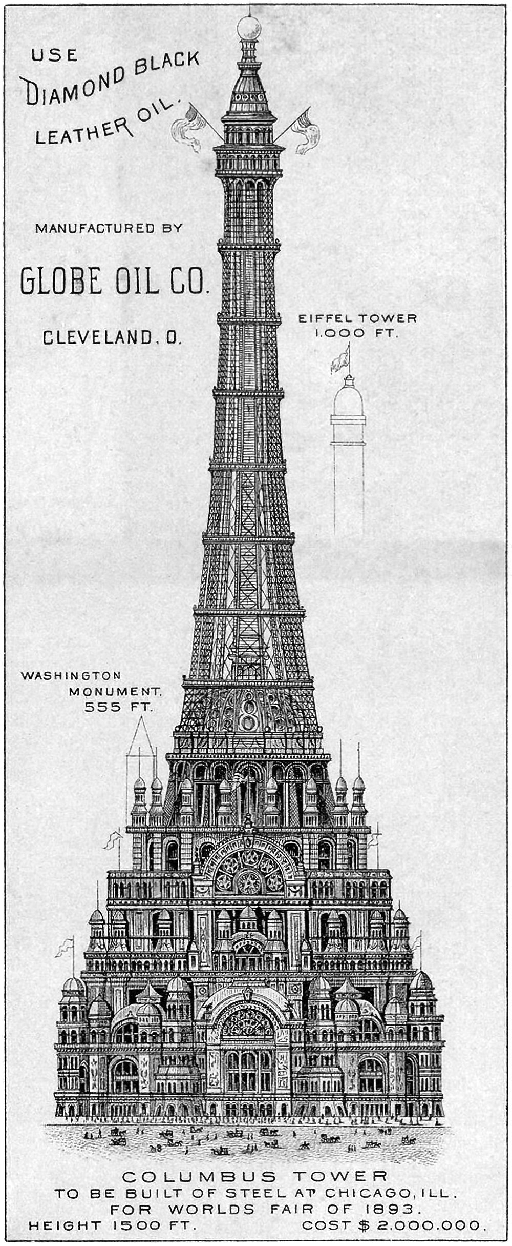
The Chicago Columbus Tower
Pictured above is the proposed Chicago Columbus Tower, which was designed to be the centerpiece of the 1893 World’s Columbian Exposition in Chicago. It was 455 meters (1,500 feet) tall and would’ve cost two million dollars at the time (roughly 62 million dollars today). It’s an elaborate and ambitious proposal that was meant to out-Eiffel the Eiffel Tower, which was built for the previous World’s Fair in 1889. As if to hit this point home, the above illustration includes height references to the Eiffel Tower and the Washington Monument, which would’ve been dwarfed by this new structure.
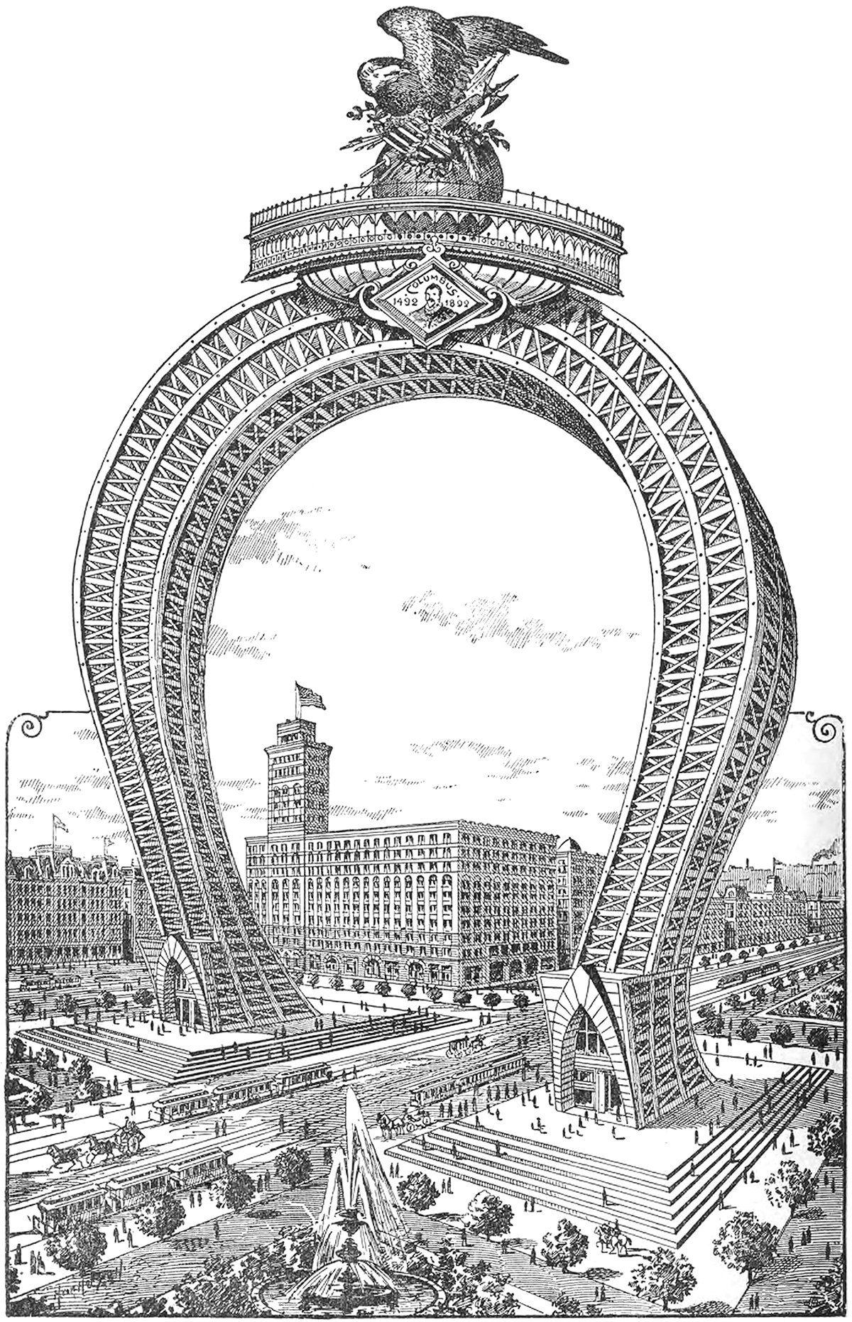
The Columbian Triumphal Arch
Here’s a doozy. It’s an 1891 proposal for a monumental arch that would’ve been the crown of the 1893 World’s Columbian Exposition in Chicago. It would’ve straddled South Michigan Avenue on the block adjacent to the Auditorium Building, which can be seen just behind the arch in the illustration. I can’t find any information on the designer, but whoever drew it up was no stranger to the Daniel Burnham quote make no small plans.
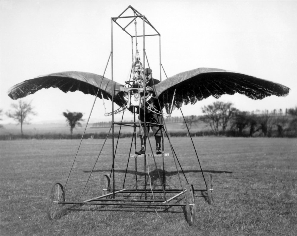
E.P. Frost’s Ornithopters
Pictured above is a photo of E.P. Frost’s second ornithopter prototype. It consisted of a large a pair of wings and a metal scaffold, and it was powered by an internal combustion engine. According to Frost, the machine successfully achieved liftoff under its own power in 1904. This wasn’t a sustained flight, however, but rather a jump or a hop.
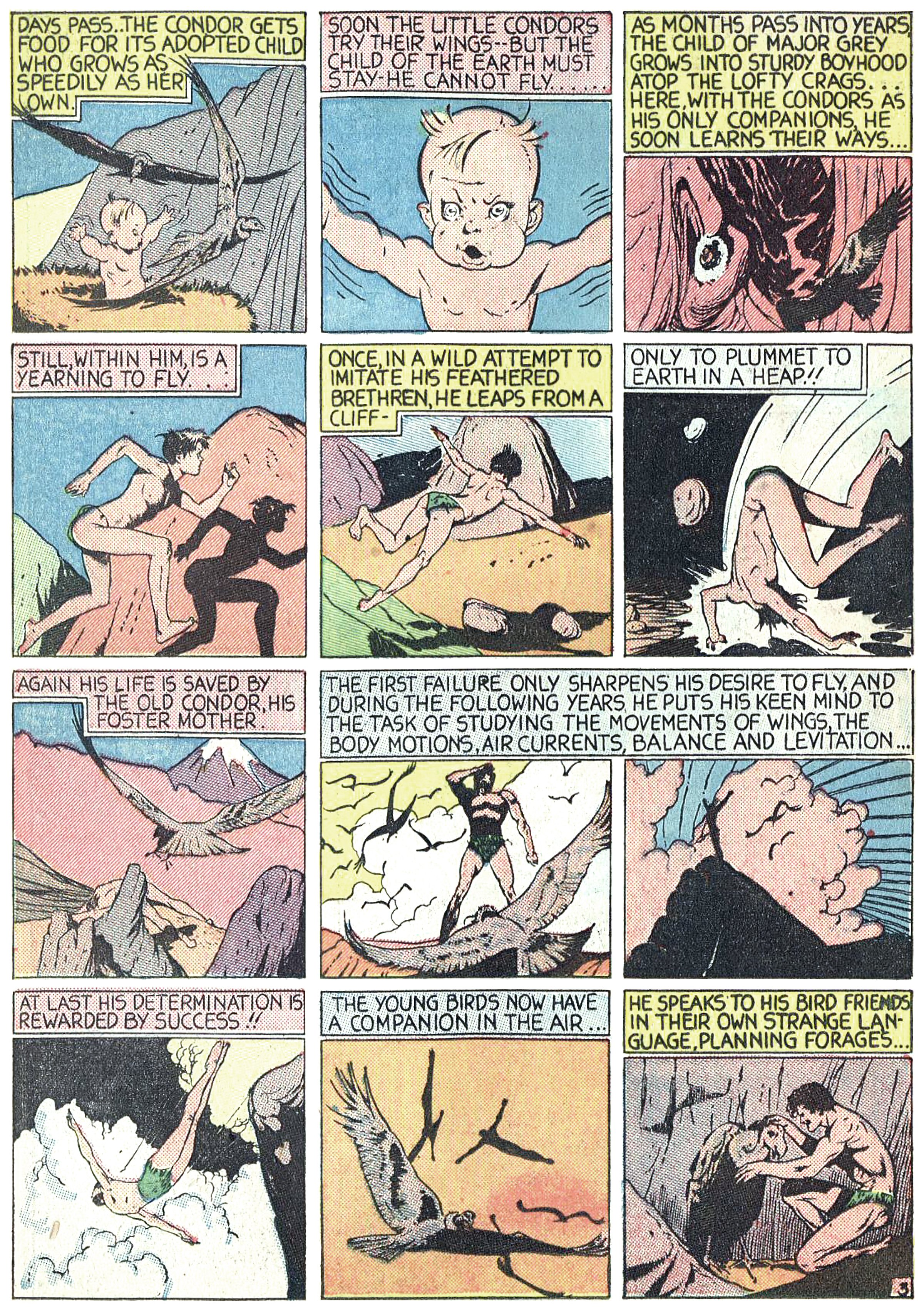
The Black Condor : The Man Who Can Fly Like A Bird
The first failure only sharpens his desire to fly, and during the following years, he puts his keen mind to the task of studying the movements of wings, the body motions, air currents, balance and levitation.
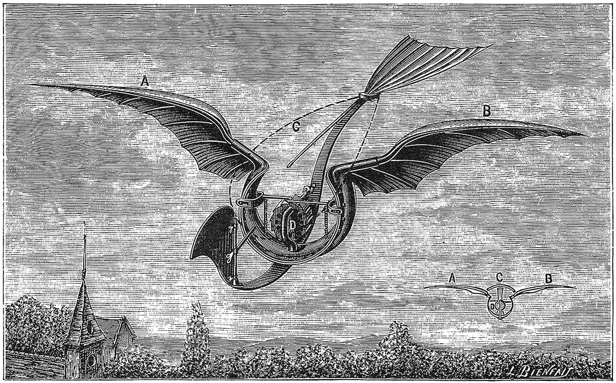
Gustave Trouvé’s Flügelflieger
Pictured above is an ornithopter design from 1891 by French polymath and inventor Gustave Trouvé. It was called the Flügelflieger, which means winged flyer in German. It featured a pair of wings, a tail, a front rudder, and it was powered by a centrally-placed rapid-succession gun cartridge. Due to the gunpowder charges, the machine was quite loud when flapping. It did work though; according to Trouvé it made a successful flight of 80 meters (262 feet) on 24 August 1891.
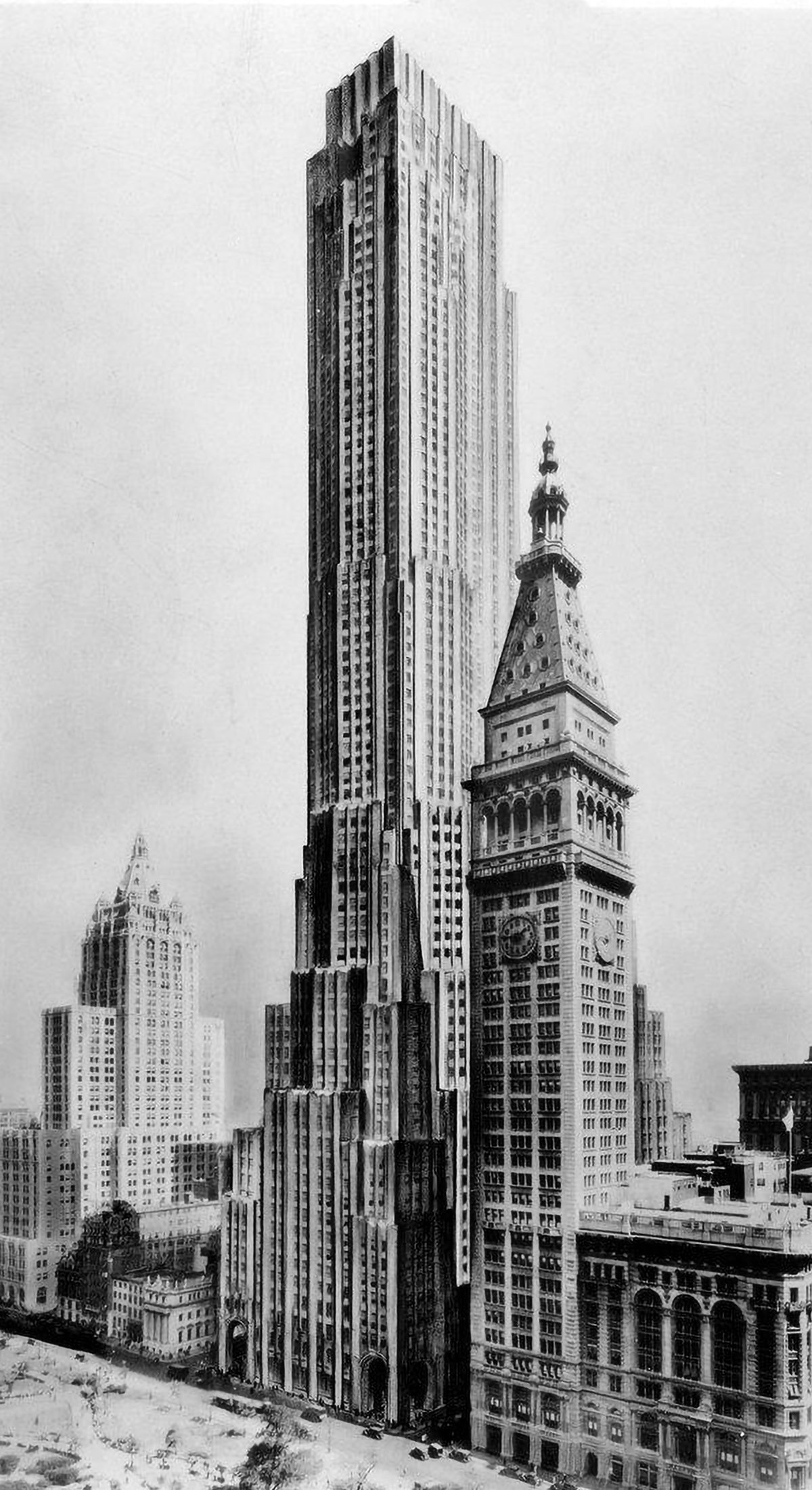
Best-Laid Plans : The Metropolitan Life North Building
The best-laid plans of mice and men oft go astray. This quote pretty much sums up the story of the Metropolitan Life North Building. What began as a design for the world’s tallest building ended with a bulky mid-rise building that feels too grand for its modest height. Pictured above is an illustration of the original design, located on the east side of Madison Square Park in New York City. Topping out at 100 stories tall, it would’ve been the tallest building in New York by a long shot. Then the Great Depression happened.
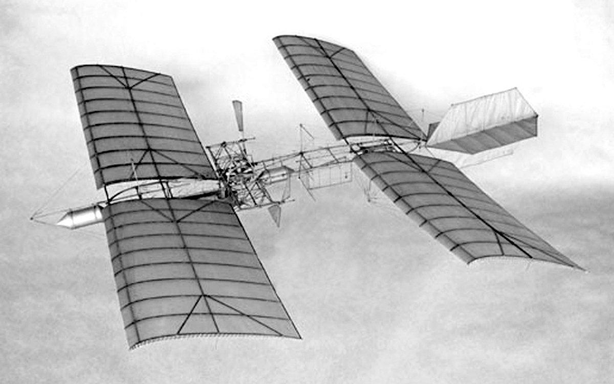
Samuel Langley’s Aerodrome
Samuel Langley was an astronomer and physicist who was the third secretary of the Smithsonian Institution. He was also a pioneer of aviation, most famous for his designs of the Langley Aerodrome, which he built and tested from 1901 to 1903. Pictured above is a photo of his Aerodrome No. 5, which was a pilot-less model that had success flying. Langley was unable to repeat this success with larger, piloted designs, however.
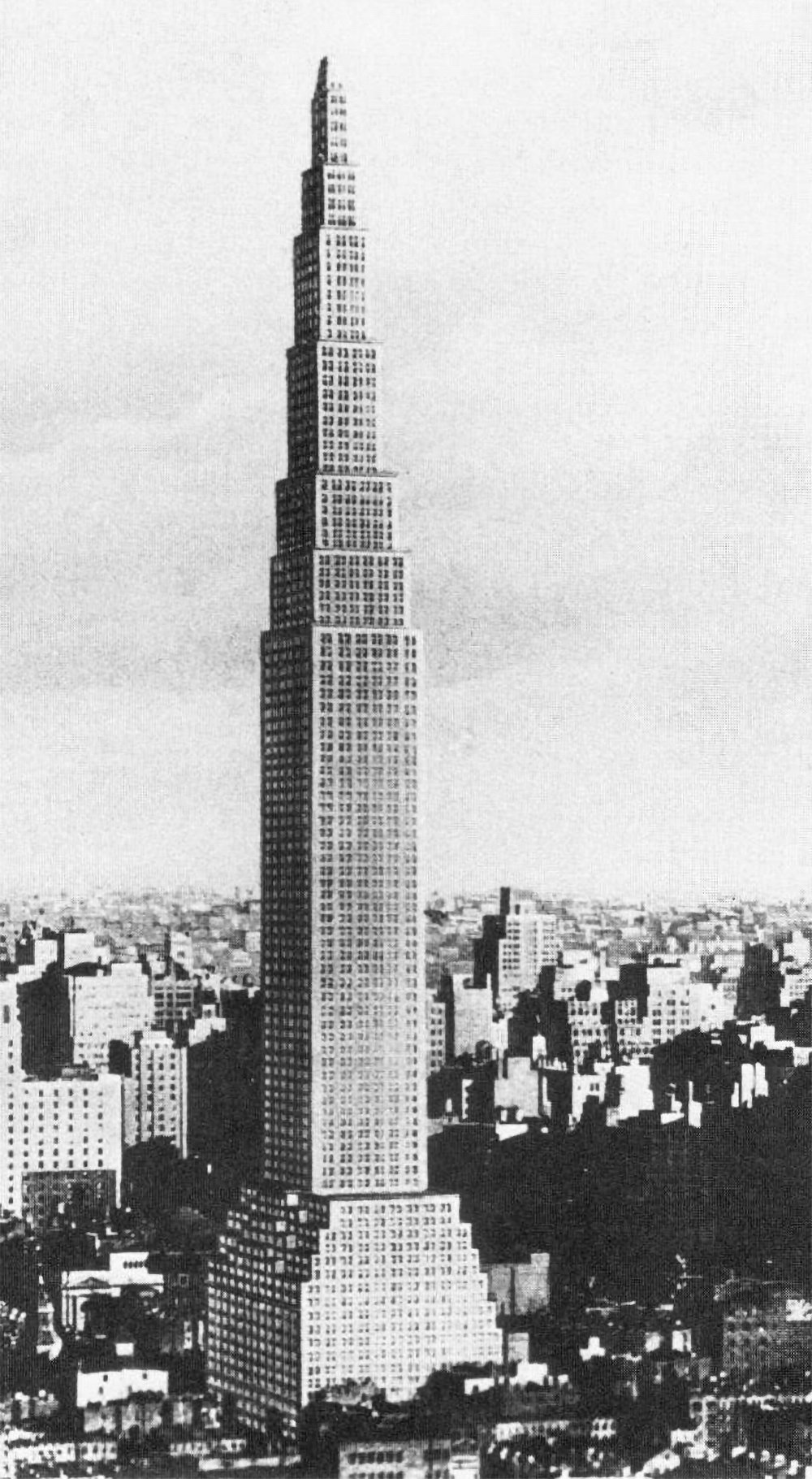
The Larkin Tower
Nearly all proposals for the tallest building in the world include some type of defining element or design flourish that make them unique and memorable. The Chrysler Building has its metallic crown. The Empire State Building has it’s mooring mast and antenna. Not the Larkin Building. It was designed in 1926 for a site on 42nd Street on Manhattan, and it was 368 meters (1,207 feet) tall, making it the tallest structure in the world by a long shot. Aside from this, there’s not much else to say about it.

The Towering Centerpiece of an International World Centre
Pictured above is a monumental tower designed by Ernest Hébrard as part of a design for an international world centre. It was a visionary project without a real location, and I suspect it was either academic, or he designed it in order to make a name for himself as an architect and an artist. Either way, this tower was the centerpiece of a much larger plan, but it speaks volumes about Hébrard’s intent with the plan.
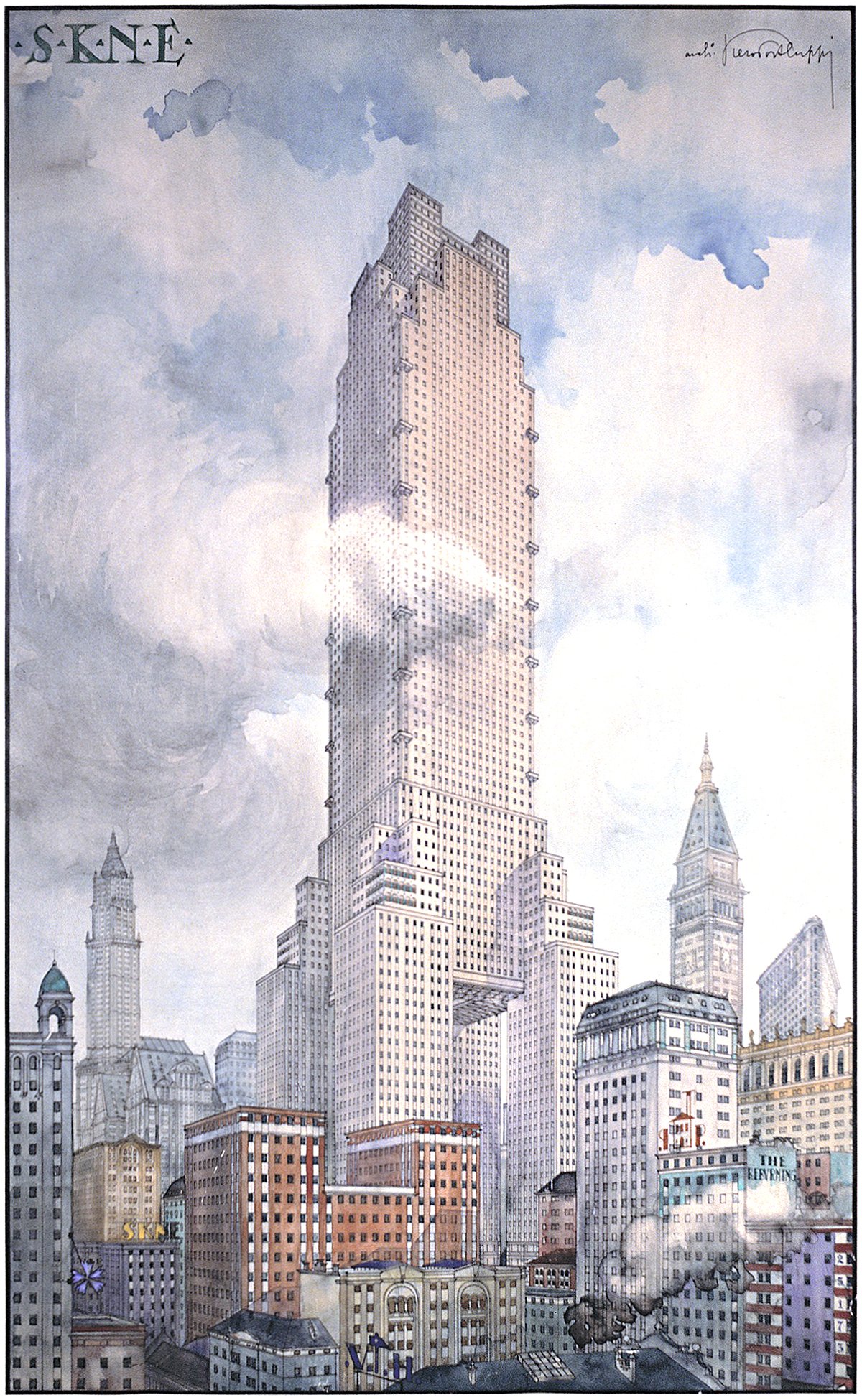
Piero Portaluppi’s SKNE Company Skyscraper
Pictured above is a conceptual design for a skyscraper by Piero Portaluppi from 1920. It was designed as the headquarters of the SKNE company for a site somewhere in New York. There’s two interesting angles here. The first is the tower itself, and the second is the method of representation shown.
