Best-Laid Plans : The Metropolitan Life North Building
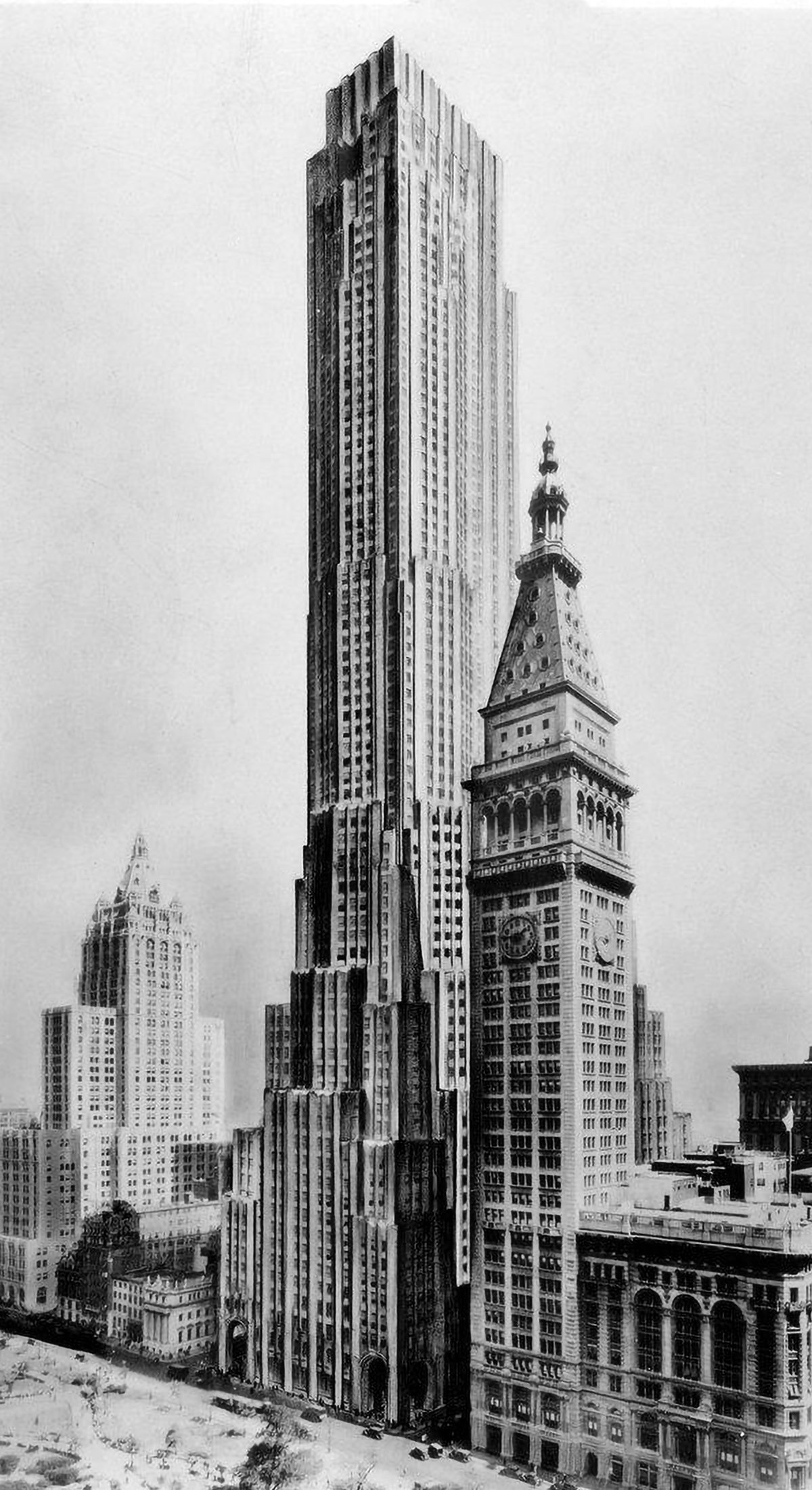
Original design for the Metropolitan Life North Building, which would’ve towered over the adjacent MetLife Tower and would’ve been the tallest building in the world.
The best-laid plans of mice and men oft go astray.
This quote pretty much sums up the story of the Metropolitan Life North Building. What began as a design for the world’s tallest building ended with a bulky mid-rise building that feels too grand for its modest height. Pictured above is an illustration of the original design, located on the east side of Madison Square Park in New York City. Topping out at 100 stories tall, it would’ve been the tallest building in New York by a long shot. Then the Great Depression happened.
Construction of the Metropolitan Life North Building began in 1929, just before the onset of the Great Depression. After the stock market bottomed out in November 1930, updated plans were re-submitted for a much shorter, 28-story building. This scaled-down version is essentially a chopped-off version of the original, and it was subsequently built in three phases. The built result is pictured below. Instead of the soaring tower pictured above, we’re left with a mid-rise building that’s shorter than its neighbor to the south.
When an architect is designing the tallest building in the world, care must be taken to make sure every part of the design feels grand and important. The built version of the Metropolitan Life North Building retains this grand feeling at its base, but it doesn’t have the world’s tallest building above it to support this feeling. What we’re left with is a building that feels big without actually being big. At the ground level, each corner is carved away into a monumental archway that provides a sense of importance. The first time I walked by it and experienced the archways, I took notice. I felt like the building was saying to me, you have arrived. Unfortunately, the building mass above these entrances did little to support this feeling, and I found myself asking where have I arrived, exactly? It taught me that verticality really does make a difference for buildings such as this. Without the status of being the tallest, a building has a much harder time asserting itself on the public.
It also taught me just how delicate the process of constructing the world’s tallest building really is. It’s a fascinatingly complex process that can go astray for myriad different reasons. The best-laid plans, indeed.
Photo of the Metropolitan Life Buildings with the built result of the North Building, cut off mid-way up its original design.
The built version of the Metropolitan Life North Building is an oft-forgotten piece of New York skyscraper history. The building itself blends in with its surroundings and doesn’t call much attention to itself, especially because right next door is the MetLife Clock Tower, which is taller and much more attention-grabbing. It goes to show that verticality is vitally important when a building is trying to make a name for itself. When you’re the tallest building in the city or the world, people pay attention. They want to visit you, lease space in you, take your picture and buy postcards of you. When you’re just another mid-rise building without the tallest label, it’s much harder to get people to look at you. This is the power of verticality.
Check out other posts about unbuilt skyscrapers here.
Check out other posts about New York here.


