Welcome to On Verticality. This blog explores the innate human need to escape the surface of the earth, and our struggles to do so throughout history. If you’re new here, a good place to start is the Theory of Verticality section or the Introduction to Verticality. If you want to receive updates on what’s new with the blog, you can use the Subscribe page to sign up. Thanks for visiting!
Click to filter posts by the three main subjects for the blog : Architecture, Flight and Mountains.
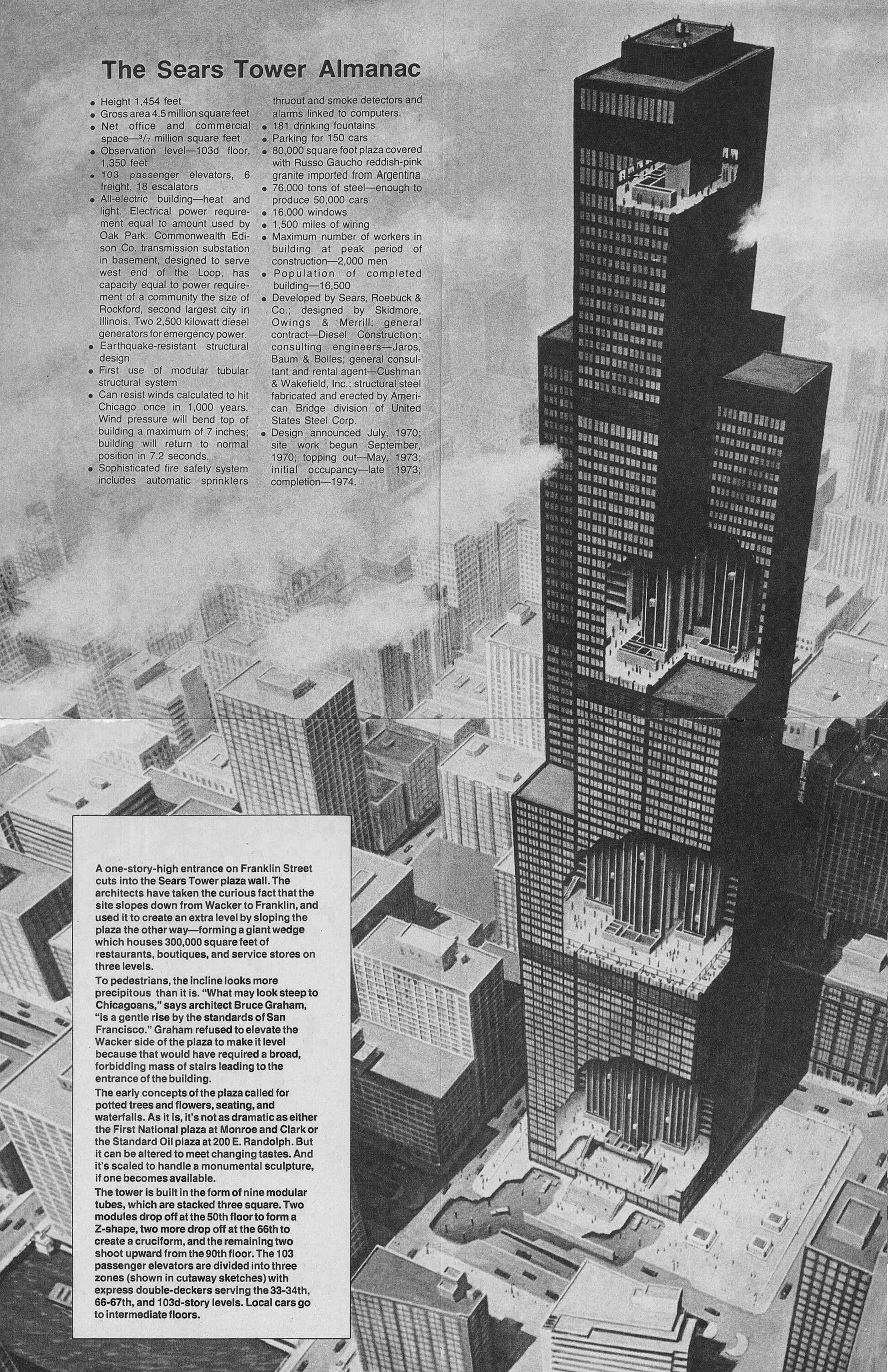
The Original Flat-topped Sears Tower
The above illustration shows the original design for the Sears Tower in Chicago, along with a bunch of factoids related to the scale of the building. Upon first glance, the first thing that stood out to me was the flat roof and lack of the building’s now-iconic antennae. As with most skyscrapers of this size, the building feels quite different without the white spires that are now so closely associated with the skyscraper. Similarly, imagine the Empire State Building without it’s spire, or the John Hancock Center without it’s antennae. It’s just not the same.

Zeus, Poseidon and Hades : The Verticality of the Greek Gods
Nearly all ancient belief systems are based on the surface, the underground, and the sky in some way. These three concepts represent something primal for humans, and throughout history we’ve attached myriad meanings and stories to the relationship between them. Typically, they’re either represented by an abstract concept or a god. An example of the former is the Christian idea of heaven and hell. An example of the latter is the Ancient Greek gods Zeus and Hades.
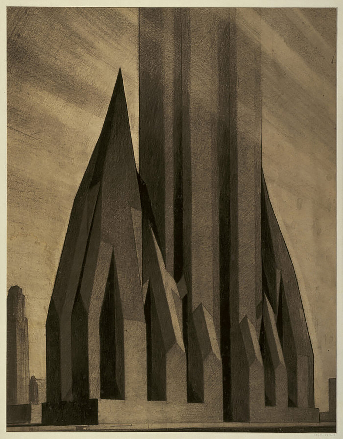
Zoning Envelopes and the New York Skyscraper
Back in architecture school, I had a professor once say that the most effective way to create change is to adjust the building code. That way every architect must conform their designs to meet the code’s requirements, which is much more impactful than any single building could ever be. It was sage advice, and throughout the history of skyscrapers, it rings true. Throughout the history of skyscrapers, arguably the most influential of these changes occurred in 1916 in New York City.
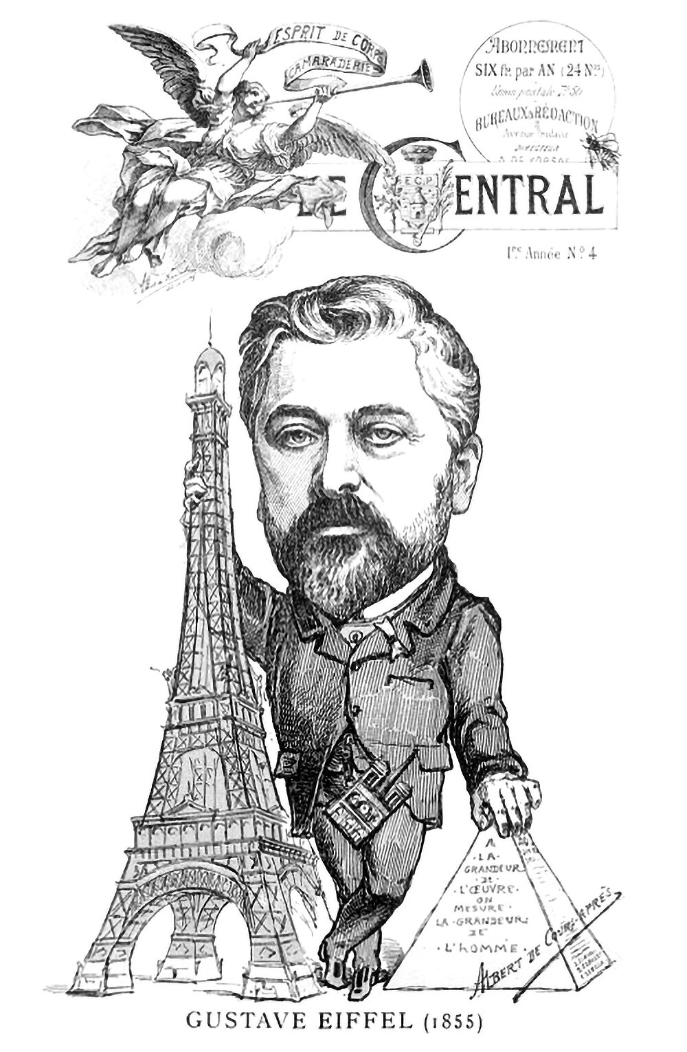
By the size of the work, we measure the size of man
The above illustration is from the cover of an 1889 issue of Le Central. It shows a caricature of Gustave Eiffel standing in between his Eiffel Tower and the Great Pyramid. Inscribed on the pyramid is the phrase A la grandeur de l'oeuvre on mesure la grandeur de l'homme, or By the size of the work we measure the size of man. It’s a statement on verticality, and it illustrates how the height of these structures is their defining characteristic in the eyes of the public.
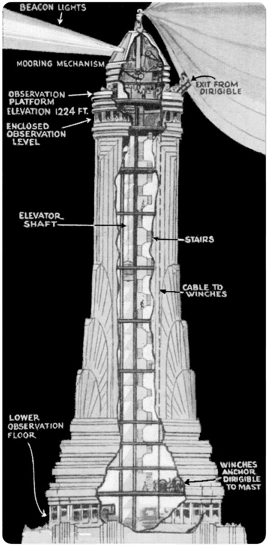
The Empire State Building’s Mooring Mast
Pictured above is an illustration from Popular Mechanics that shows the Empire State Building’s proposed mooring mast. This mast was designed to act as a dock for dirigibles, who could moor themselves to the top of the tower’s crown and load and unload passengers. It’s a wild idea, albeit completely impractical.
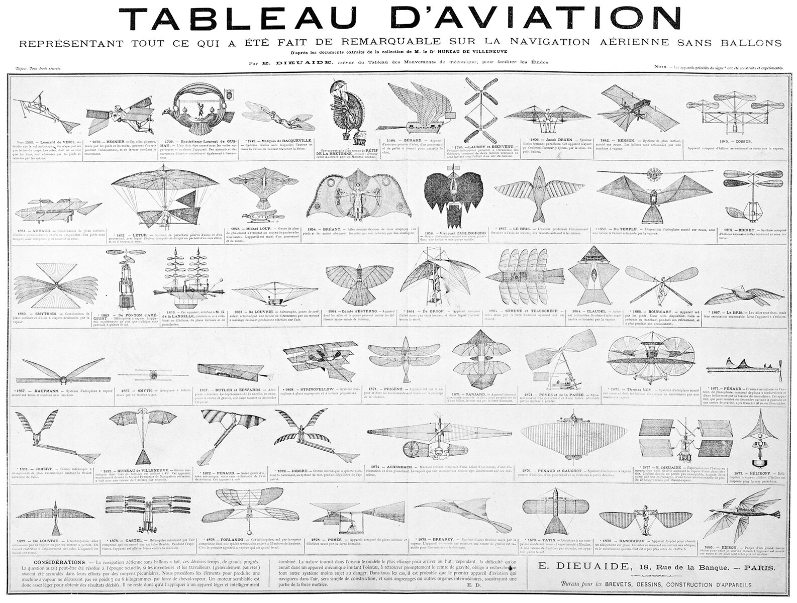
Tableau d’Aviation
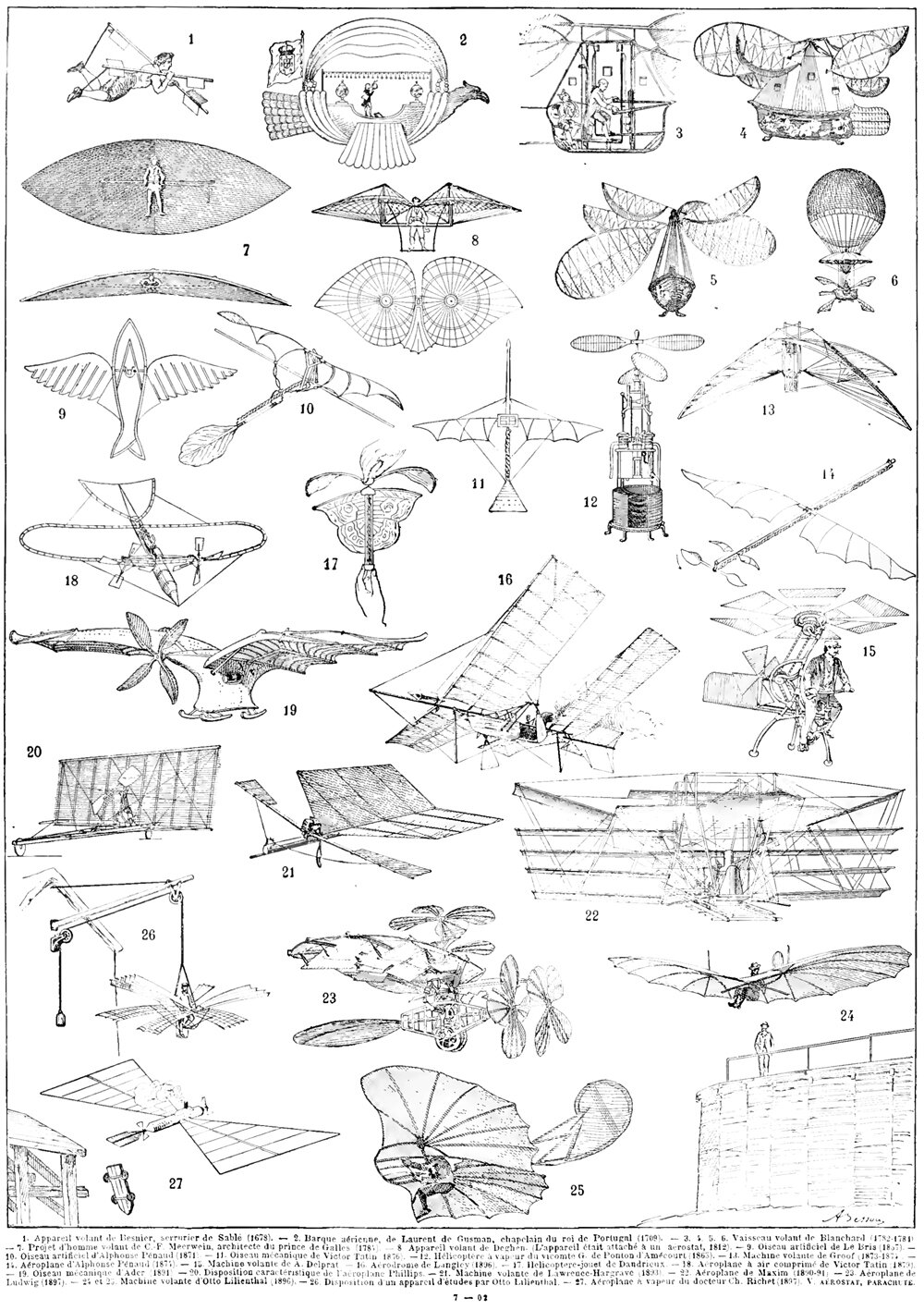
The creativity and ingenuity on display throughout the history of flying machines is amazing. A quick survey of the table above shows the wide variety of ideas tried out before we humans successfully learned how to fly. One thing I love about this table is that it includes fictional flying machines as well as real prototypes. This shows that fictional designs can and have influenced the history of flight just as real prototypes have.
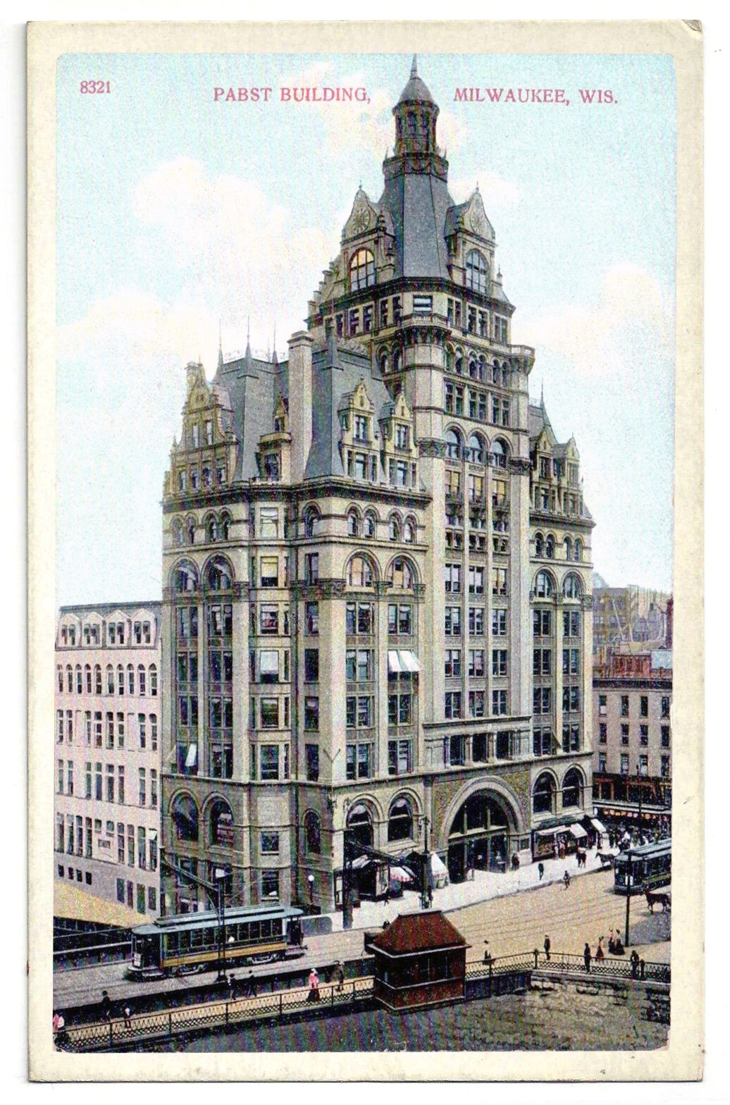
The Pabst Building and the Symbolism of Verticality
In 1890, Frederick Pabst purchased a plot of land at the center of downtown Milwaukee, on which he planned to build a headquarters for his brewing empire. A year later, the Pabst Building was complete. Standing fourteen stories and 235 feet (71 meters) tall, it was the tallest building in the city at the time, and it was a wonderfully detailed example of the Renaissance Revival style. Being Milwaukee’s tallest building was symbolic for Pabst and for the city, however his building’s dominance wouldn’t last as long as he’d hoped.
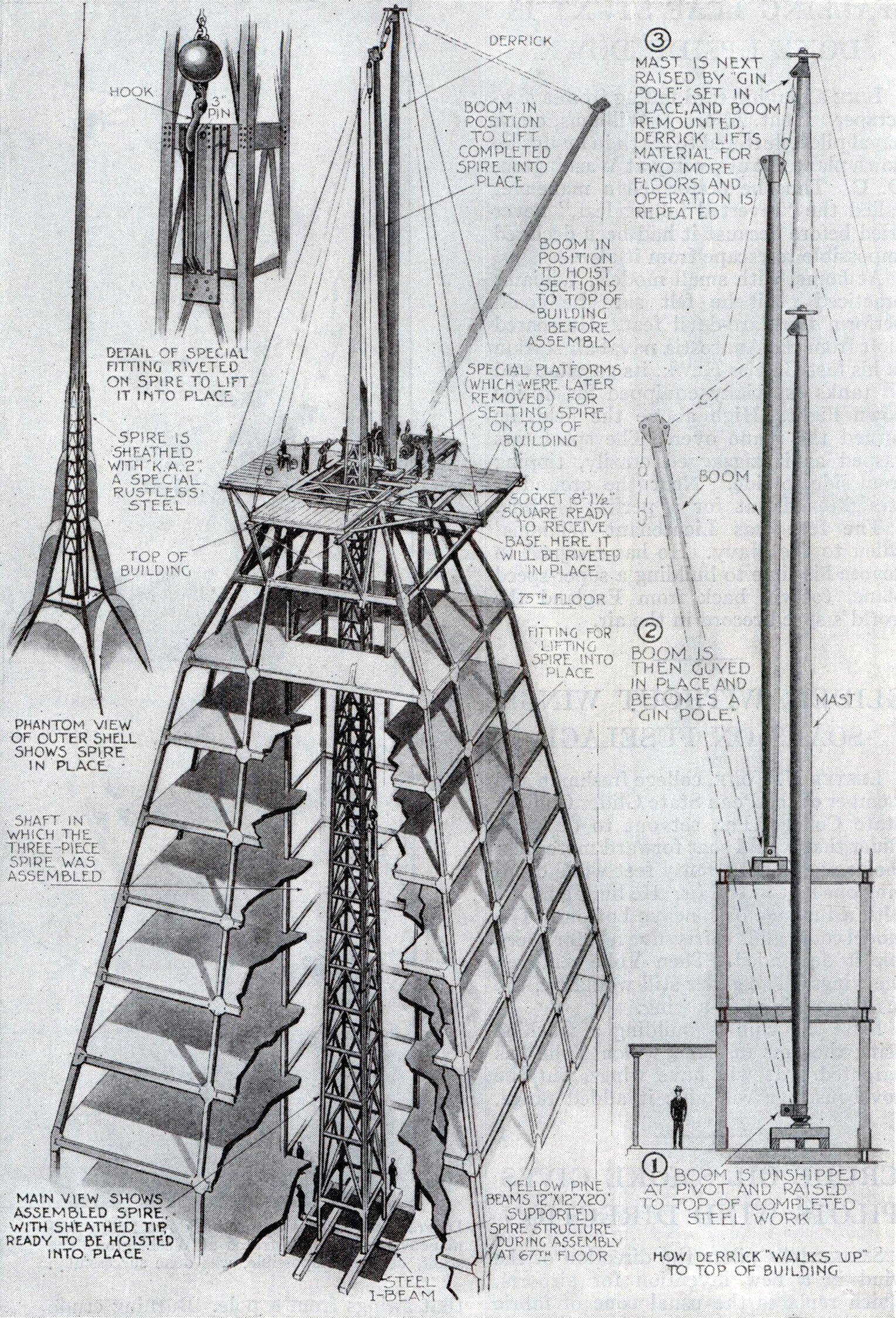
The Chrysler Building’s Hidden Spire
If you’re competing to build the tallest building in the world, and you want to conceal the final height until the last possible moment, how do you go about it? Well, you construct the spire inside the crown of the building, wait for your competitor to finish his tower, then lift your spire into place and take the title from him, of course.
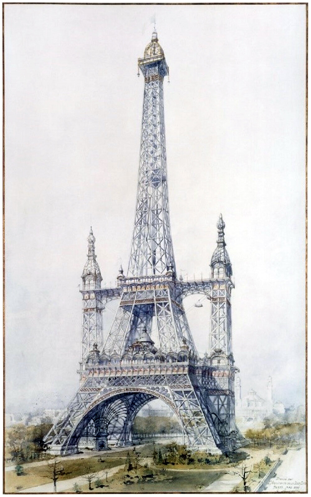
Alternate Realities : The Eiffel Tower
There’s an interesting subtext to unbuilt projects throughout the history of architecture. Unbuilt additions to existing buildings are the most intriguing, because they respond to an existing mind-scape rather than create a new one. The above illustration is a perfect example of this. It shows a preliminary design for the Eiffel Tower in Paris, drawn by French architect Stephen Sauvestre.
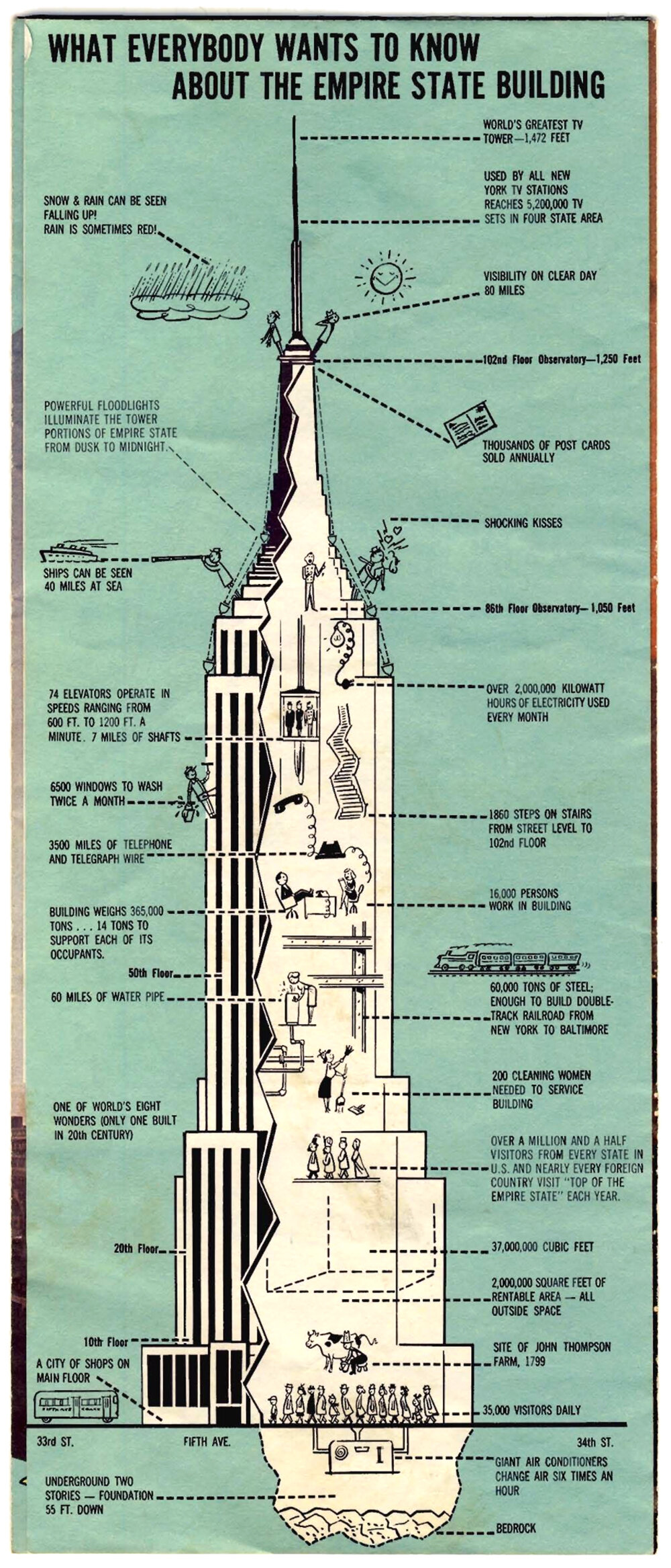
What Everybody Wants To Know About The Empire State Building
Only the most famous and iconic buildings of the world get their own marketing. The Empire State Building in New York City is one of these, and the brochure pictured above is a fantastic little bit of marketing for the tower. I don’t know when it was made or where it was sold, but given the television antenna at the summit, which was installed in 1965, it’s probably from the late 1960’s or 70’s.
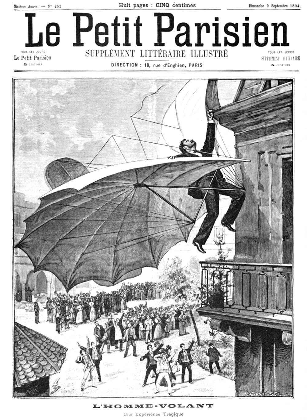
L’Homme Volant
Pictured above is the cover of Le Petit Parisien from 9 September 1894. It shows German aviation pioneer Otto Lilienthal dangling from a building cornice, with a crowd of onlookers below. According to the paper, the illustration was drawn from a photograph which was taken a few days earlier in Frankfurt, Germany.
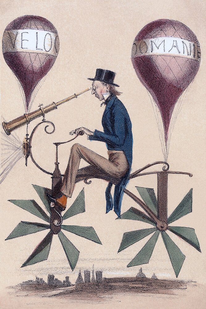
A Voyage to the Moon
There’s a fine line between fiction and invention. Throughout my research into flying machines, I’ve come across many fictional designs that weren’t meant to actually fly, but to evoke the idea of flight. The above cartoon is one of these. It’s a French cartoon from 1867, titled Voyage a la Lune, or Voyage to the Moon. It riffs on the idea of a bicycle that flies, and it’s got a playful feeling about it, as if it doesn’t take itself seriously.
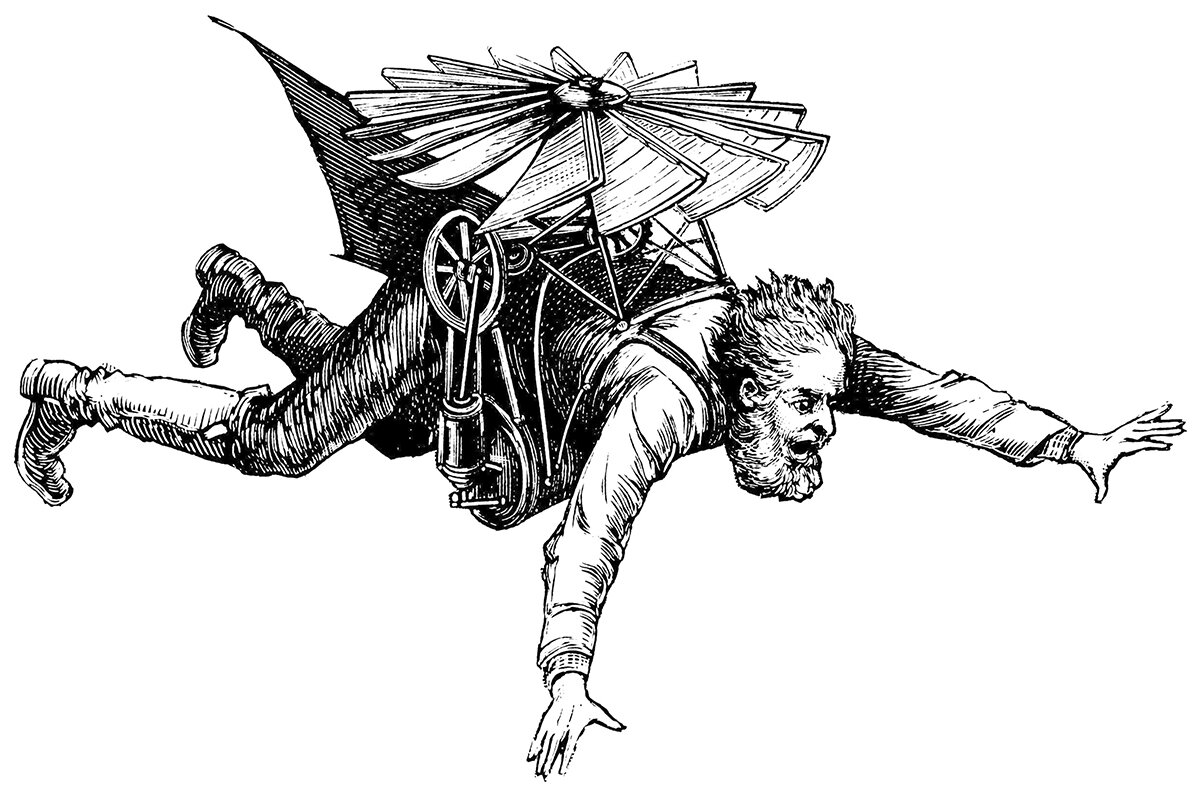
Those Wacky Victorian Flying Machines
Throughout my research into the history of flight and flying machines, I’ve come across a few examples that I cannot find any description or context for. I’m calling them Victorian because they’re illustrated in a similar style to that time period, but I’ve been unable to date them with any certainty. If anyone has any information about these contraptions or their creators, please let me know!
Early Balloon Designs
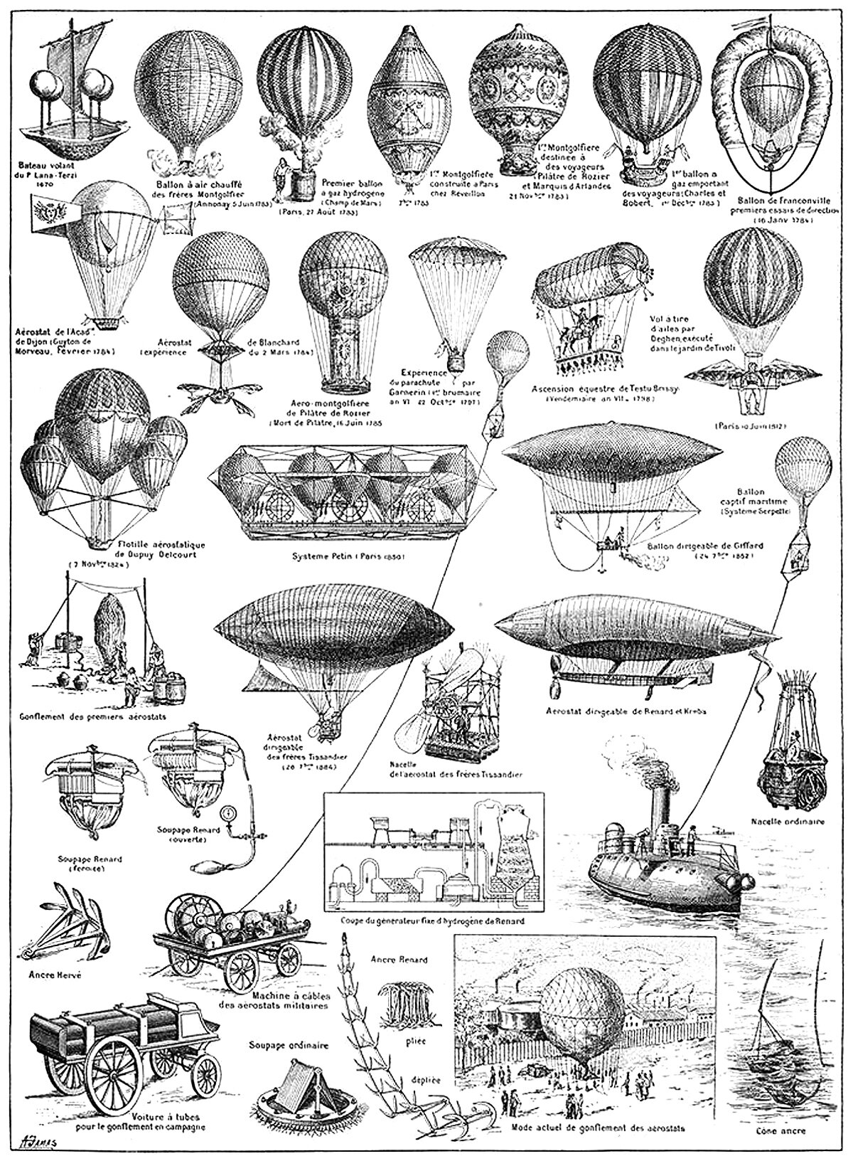
There are two main strategies when designing a flying machine. The first is a heavier-than-air machine, which relies on creating a lifting force to overcome gravity. The second is a lighter-than-air machine, which relies on a balloon filled with gas or heated air. The above illustration shows famous examples of the latter.
Flying Machines
Throughout history, humans have been fascinated with flight, and some of our more industrious brothers and sisters have dedicated their lives to achieving it. This has led to a rich lineage of ideas for flying machines, and the illustration pictured here shows some famous examples throughout this lineage.
The Urban Canyon
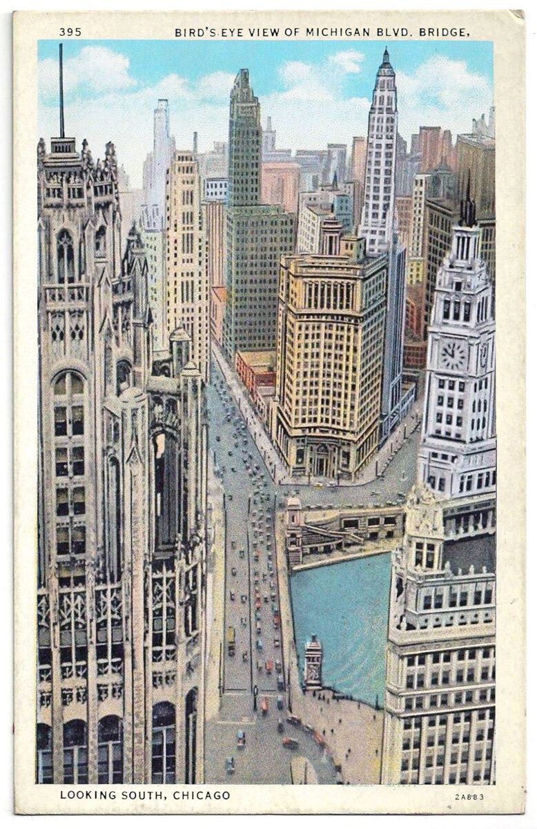
It’s difficult to reconcile the inhuman scale of the skyscraper with the human experience at street level. In most Western cities of today, the experience of walking down the street is largely soul-less, with a relentless street wall rising up on both sides and massive towers rising above that, usually set back from the street wall a bit.
The Matrix and Verticality
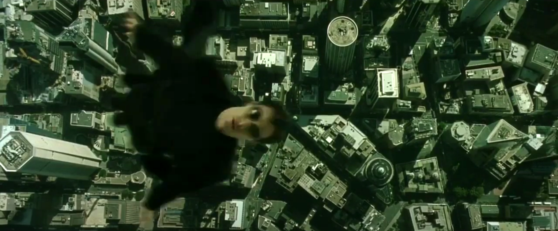
I was watching the first Matrix movie a few days ago, and the ending scene stuck with me. It features the main character Neo, flying high above the city. Neo is a character that transforms into a God-like figure throughout the movie, and the end scene represents him realizing his full potential. What struck me was the writers’ choice to encapsulate this moment by showing him flying.
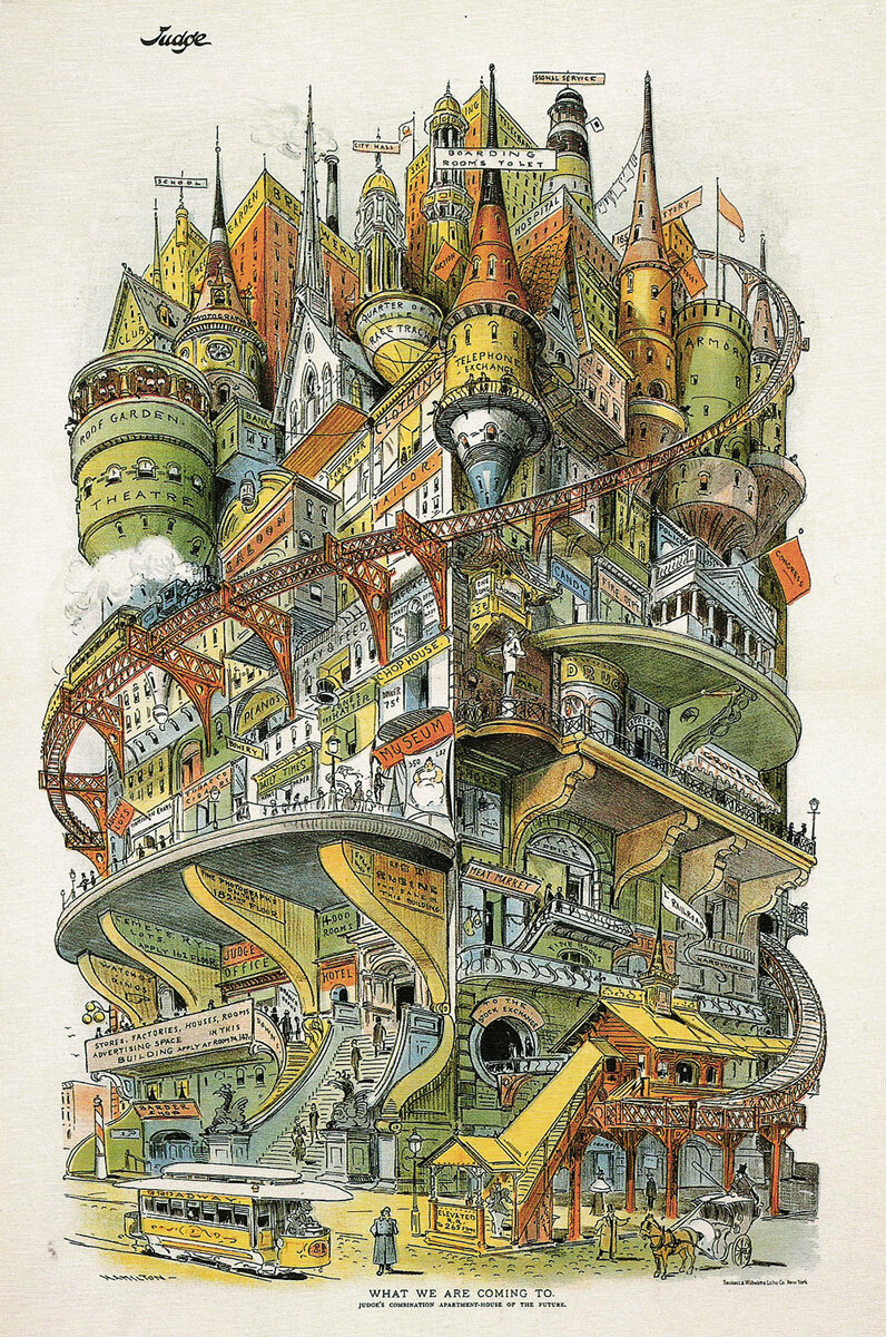
What We Are Coming To
If you wanted to cram every possible building type into a single structure, what might that structure look like? It’s a hell of a design problem, and the image above shows one artist’s idea of what it might look like. It’s an illustration by Grant E. Hamilton, called What We Are Coming To. It appeared in an 1895 issue of Judge magazine, with the headline ‘Judge’s combination apartment house of the future.’
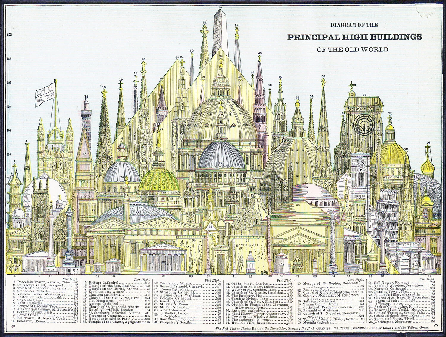
Domes and Steeples of the Old World
This drawing is from an 1884 issue of Cram's Unrivaled Family Atlas of the World, and it depicts the Principal High Buildings of the Old World. What’s striking about the composition is how many domes and steeples are featured. Aside from the hulking pyramids in the middle ground, there is a forest of slender steeples running along the background, along with a bunch of bulky domes that dominate the middle of the diagram. Steeples and domes were our most popular methods for achieving Verticality throughout history, with each form pushing up towards the sky and announcing its presence, and therefore importance, to the surrounding landscape.

Forests and Verticality
The progression of forest growth over time is based on access to and competition for sunlight. This process is based on Verticality. As a plant grows taller, it casts a shadow on everything below its foliage, hindering the growth of smaller plants below. This process can be found throughout the natural world, and it follows a pattern of regrowth called plant succession.
